Category
Graphic, Logo, WebAbout This Project
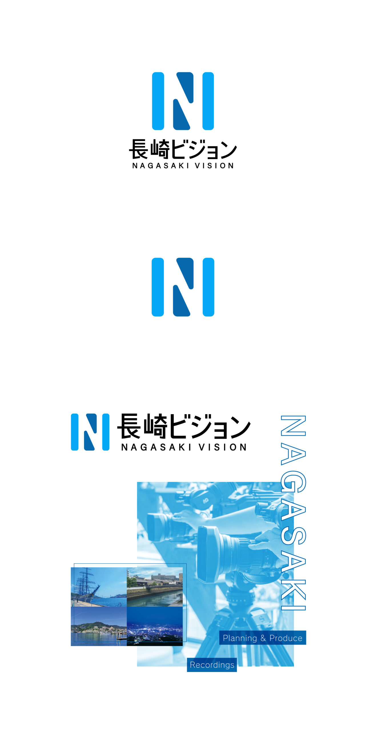
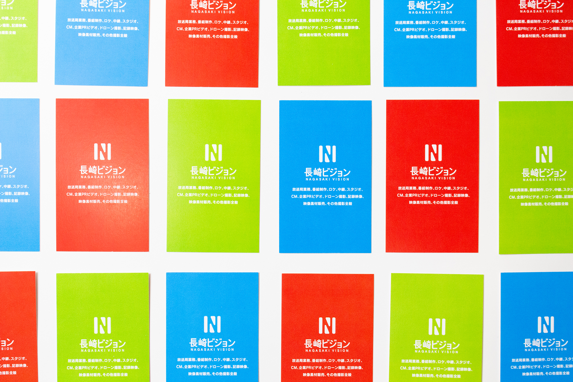
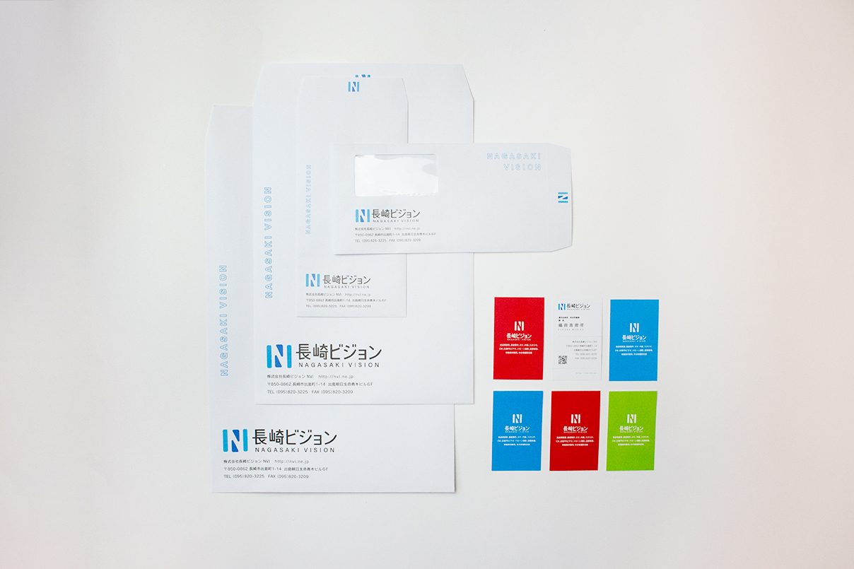
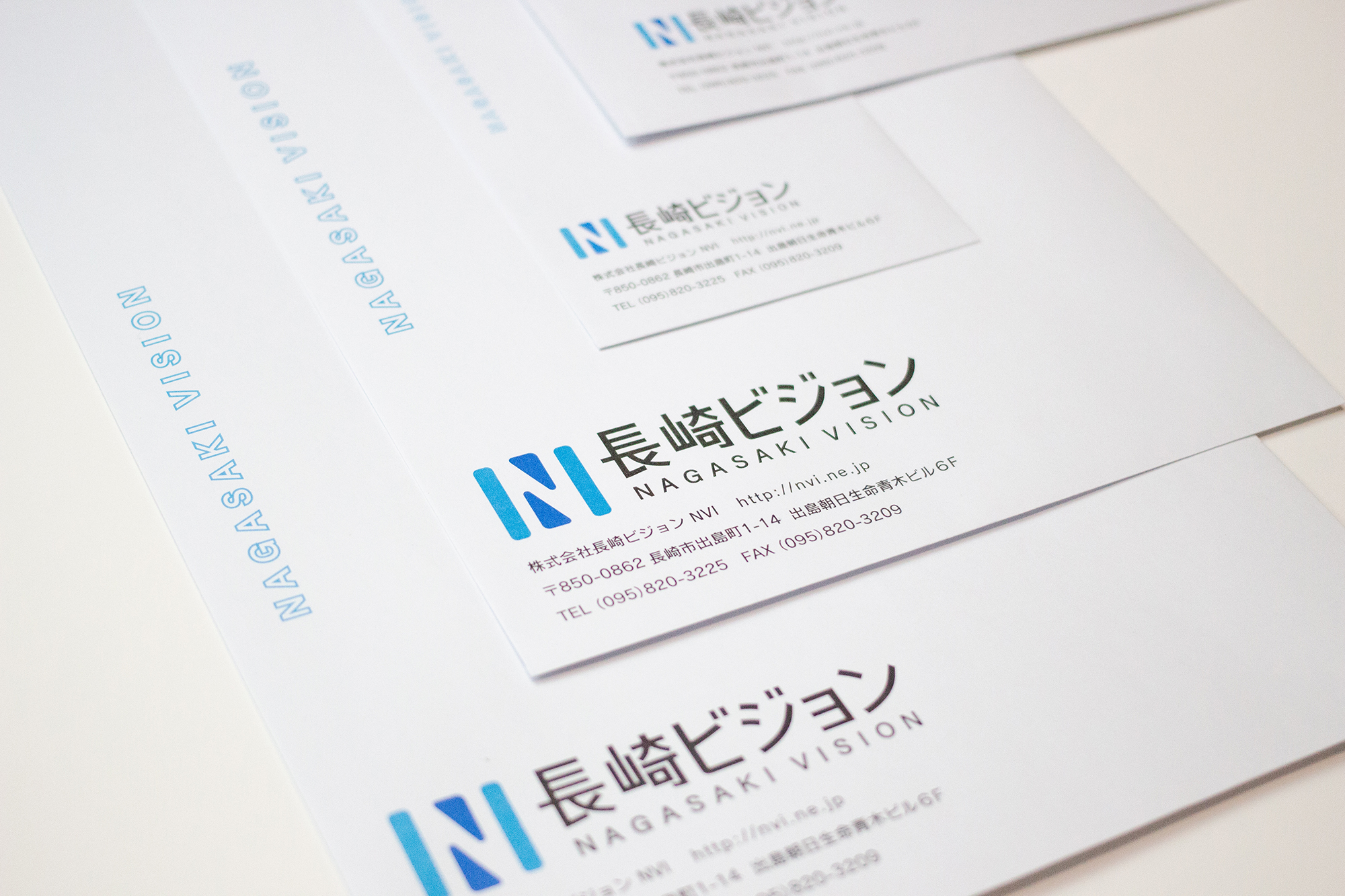
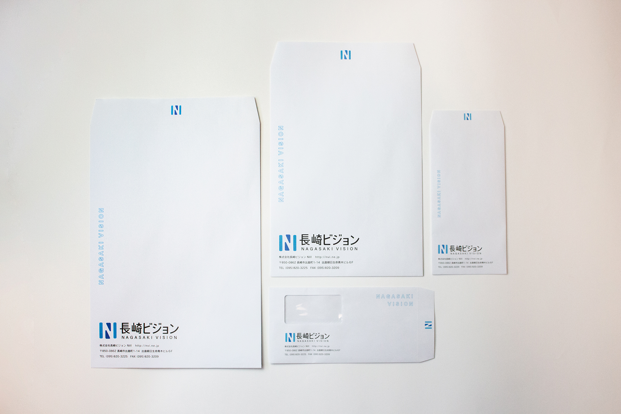
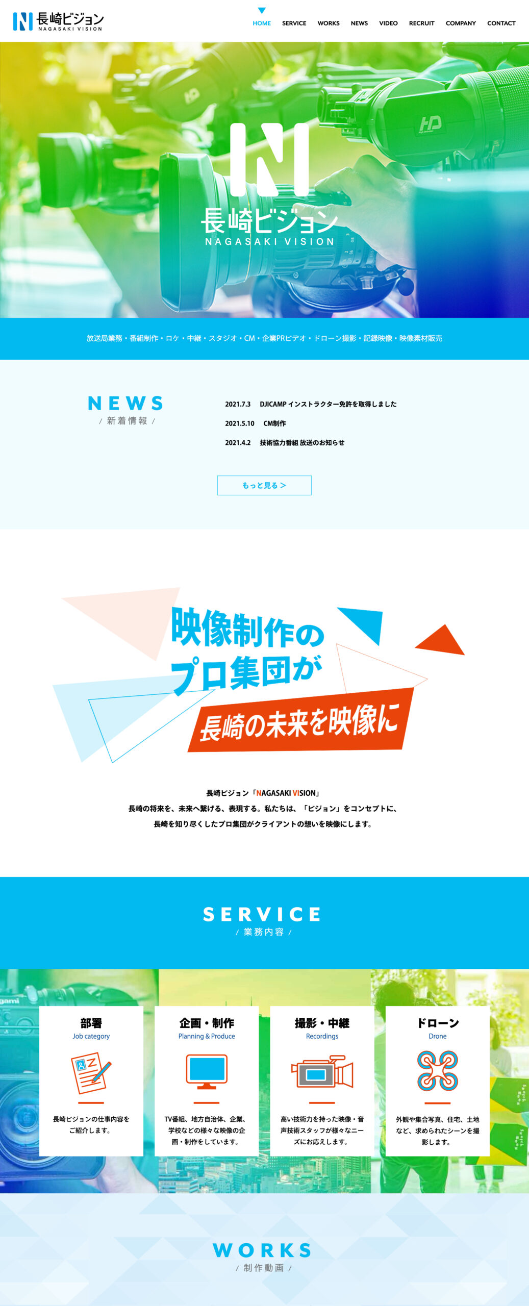
長崎・出島に位置する長崎ビジョン様は、海のブルーをコーポレートカラーとしました。長崎港から大海原へと広がるブルー、電波塔がある稲佐山の上空に広がる空のブルー、長崎の夜景を際立たせるディープなブルー、色んなブルーが優しく交じり合い、長崎を象徴した「N」をメインにロゴマークをデザインです。そしてこのブルーには「爽やか」・「真面目」・「真摯」でありたいと想いを重ねています。ロゴマーク、ホームページ、名刺、封筒、その他販促物の制作を担当しました。
Nagasaki Vision, located in Dejima, Nagasaki, has chosen ocean blue as its corporate colour. The logo design features various shades of blue representing different aspects of Nagasaki: the blue expanse of the ocean from Nagasaki Port, the sky blue above Inasayama with the radio tower, and the deep blue that enhances Nagasaki’s night view. These blues blend softly together around the main “N” symbol, symbolizing Nagasaki. The colour blue conveys a sense of “refreshing,” “seriousness,” and “sincerity.” I was responsible for creating the logo, website, business cards, envelopes, and other promotional materials.
Website link https://nvi.ne.jp/